
Achieving matplotlib ggplot-like results using Rust plotters crate
The following Rust code is the closest I could get to the matplotlib ggplot example using the Rust plotters crate.
Rust code
src/main.rs
use plotters::prelude::*;
use plotters::style::{RGBColor, ShapeStyle};
use std::error::Error;

const GGPLOT_RED: RGBColor = RGBColor(0xE2, 0x4A, 0x33);

fn main() -> Result<(), Box<dyn Error>> {
    // Create a drawing area and set up the chart
    let root = BitMapBackend::new("sine_wave_plot.png", (1024, 768)).into_drawing_area();
    // overall figure background (keep it white)
    root.fill(&WHITE)?;

    // Define the chart area (we'll make the plotting panel light grey to be the grid background)
    let mut chart = ChartBuilder::on(&root)
        .caption("Sine Wave", ("sans-serif", 30).into_font())
        .margin(24)
        .x_label_area_size(50)
        .y_label_area_size(50)
        .build_cartesian_2d(0f64..2f64 * std::f64::consts::PI, -1.2f64..1.2f64)?;

    // Fill plotting area with a light grey to be the grid background
    // matplotlib ggplot: axes.facecolor = E5E5E5
    chart.plotting_area().fill(&RGBColor(0xE5, 0xE5, 0xE5))?;

    // Configure the mesh (ggplot-like style with subtle grid lines)
    chart.configure_mesh()
        .x_labels(10)
        .y_labels(5)
        .x_label_formatter(&|x| format!("{:.1}π", x / std::f64::consts::PI))
        .y_label_formatter(&|y| format!("{:.1}", y))
        .x_desc("Angle (radians)")
        .y_desc("Amplitude")
        // matplotlib ggplot: axes.labelcolor/xtick.color/ytick.color = 555555
        .label_style(TextStyle::from(("sans-serif", 12).into_font()).color(&RGBColor(0x55, 0x55, 0x55)))
        .axis_desc_style(TextStyle::from(("sans-serif", 16).into_font()).color(&RGBColor(0x55, 0x55, 0x55)))
        // matplotlib ggplot: grid.color = white (major grid); minor grid is off by default
        .max_light_lines(0)
        .bold_line_style(ShapeStyle::from(&WHITE).stroke_width(1))
        .light_line_style(ShapeStyle::from(&WHITE).stroke_width(1))
        // matplotlib ggplot: axes.edgecolor = white, axes.linewidth = 1
        .axis_style(ShapeStyle::from(&WHITE).stroke_width(1))
        // ensure outward ticks (negative would point inward)
        .set_all_tick_mark_size(5)
        .draw()?;

    // Generate sine wave data points
    let mut sine_data = Vec::new();
    for i in 0..=1000 {
        let x = i as f64 * 2.0 * std::f64::consts::PI / 1000.0;
        sine_data.push((x, x.sin()));
    }

    // Draw the sine wave
    chart.draw_series(LineSeries::new(
        sine_data,
        ShapeStyle::from(&GGPLOT_RED).stroke_width(2),
    ))?
    .label("sin(x)")
    .legend(|(x, y)| PathElement::new(vec![(x, y), (x + 20, y)], ShapeStyle::from(&GGPLOT_RED).stroke_width(3)));

    // Draw the legend
    chart.configure_series_labels()
        .background_style(&RGBColor(0xE5, 0xE5, 0xE5).mix(0.9))
        .border_style(&WHITE)
        .label_font(("sans-serif", 14))
        .position(SeriesLabelPosition::UpperRight)
        .draw()?;

    Ok(())
}Cargo.toml
[package]
name = "plottest"
version = "0.1.0"
edition = "2021"

[dependencies]
plotters = "0.3.5"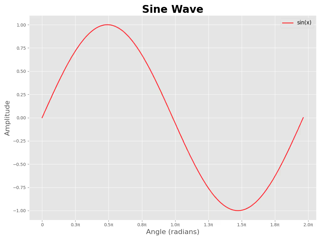
Reference Python code
sine_wave_plot.py
#!/usr/bin/env python3
"""Generate a sine wave plot in ggplot style and save to `sine_wave_plot_py.png`.

Usage:
    python3 plot_sine.py

Install dependencies:
    python3 -m pip install -r requirements.txt
"""

import numpy as np
import matplotlib.pyplot as plt
from matplotlib.ticker import FuncFormatter

plt.style.use("ggplot")

# Data
x = np.linspace(0, 2 * np.pi, 1000)
y = np.sin(x)

# Figure sized to approximate 1024x768 at 100 DPI
fig, ax = plt.subplots(figsize=(10.24, 7.68))
ax.plot(x, y, color="red", alpha=0.8, linewidth=2, label="sin(x)")

# Format x-ticks in multiples of π
def pi_label(value, _pos):
    val = value / np.pi
    if abs(val) < 1e-6:
        return "0"
    return f"{val:.1f}π"

ax.xaxis.set_major_locator(plt.MaxNLocator(10))
ax.xaxis.set_major_formatter(FuncFormatter(pi_label))

# Labels, title, legend
ax.set_xlabel("Angle (radians)", fontsize=16)
ax.set_ylabel("Amplitude", fontsize=16)
ax.set_title("Sine Wave", fontsize=24, fontweight="bold")
ax.legend(fontsize=12)

# Grid and layout
ax.grid(True)
plt.tight_layout()

# Save file
plt.savefig("sine_wave_plot_py.png", dpi=100)
# Uncomment to display interactively
# plt.show()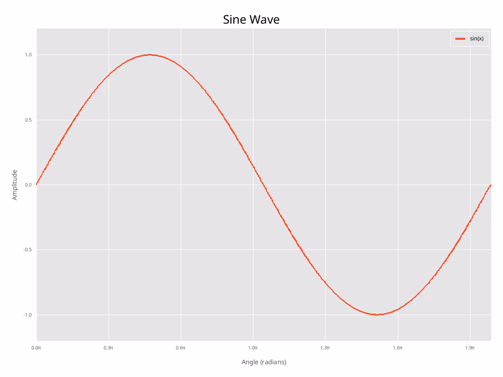
Discussion of differences
Note: I did not attempt to match font size etc in any way.
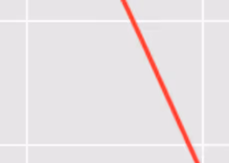
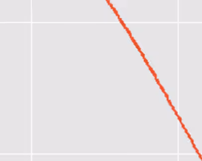
As you can see, with some manual effort, the two plots look quite similar. However, as antialising is not implemented in the plotters crate yet (as of 2026-01-30), the Rust plot looks significantly more “jagged” than the matplotlib one.
When talking about publication-quality plots, this is a significant drawback and for this reason I can not recommend. Hopefully antialiasing will be implemented in the future.
Close-up of Python antialising
Close-up of Rust “antialising” (none)
Check out similar posts by category:
Rust, Python, Data Visualization
If this post helped you, please consider buying me a coffee or donating via PayPal to support research & publishing of new posts on TechOverflow