
Erreichen von matplotlib ggplot-ähnlichen Ergebnissen mit dem Rust plotters-Crate
Der folgende Rust-Code ist das Nähest, was ich dem matplotlib-ggplot-Beispiel mit dem Rust-plotters-Crate erreichen konnte.
Rust-Code
src/main.rs
use plotters::prelude::*;
use plotters::style::{RGBColor, ShapeStyle};
use std::error::Error;

const GGPLOT_RED: RGBColor = RGBColor(0xE2, 0x4A, 0x33);

fn main() -> Result<(), Box<dyn Error>> {
    // Create a drawing area and set up the chart
    let root = BitMapBackend::new("sine_wave_plot.png", (1024, 768)).into_drawing_area();
    // overall figure background (keep it white)
    root.fill(&WHITE)?;

    // Define the chart area (we'll make the plotting panel light grey to be the grid background)
    let mut chart = ChartBuilder::on(&root)
        .caption("Sine Wave", ("sans-serif", 30).into_font())
        .margin(24)
        .x_label_area_size(50)
        .y_label_area_size(50)
        .build_cartesian_2d(0f64..2f64 * std::f64::consts::PI, -1.2f64..1.2f64)?;

    // Fill plotting area with a light grey to be the grid background
    // matplotlib ggplot: axes.facecolor = E5E5E5
    chart.plotting_area().fill(&RGBColor(0xE5, 0xE5, 0xE5))?;

    // Configure the mesh (ggplot-like style with subtle grid lines)
    chart.configure_mesh()
        .x_labels(10)
        .y_labels(5)
        .x_label_formatter(&|x| format!("{:.1}π", x / std::f64::consts::PI))
        .y_label_formatter(&|y| format!("{:.1}", y))
        .x_desc("Angle (radians)")
        .y_desc("Amplitude")
        // matplotlib ggplot: axes.labelcolor/xtick.color/ytick.color = 555555
        .label_style(TextStyle::from(("sans-serif", 12).into_font()).color(&RGBColor(0x55, 0x55, 0x55)))
        .axis_desc_style(TextStyle::from(("sans-serif", 16).into_font()).color(&RGBColor(0x55, 0x55, 0x55)))
        // matplotlib ggplot: grid.color = white (major grid); minor grid is off by default
        .max_light_lines(0)
        .bold_line_style(ShapeStyle::from(&WHITE).stroke_width(1))
        .light_line_style(ShapeStyle::from(&WHITE).stroke_width(1))
        // matplotlib ggplot: axes.edgecolor = white, axes.linewidth = 1
        .axis_style(ShapeStyle::from(&WHITE).stroke_width(1))
        // ensure outward ticks (negative would point inward)
        .set_all_tick_mark_size(5)
        .draw()?;

    // Generate sine wave data points
    let mut sine_data = Vec::new();
    for i in 0..=1000 {
        let x = i as f64 * 2.0 * std::f64::consts::PI / 1000.0;
        sine_data.push((x, x.sin()));
    }

    // Draw the sine wave
    chart.draw_series(LineSeries::new(
        sine_data,
        ShapeStyle::from(&GGPLOT_RED).stroke_width(2),
    ))?
    .label("sin(x)")
    .legend(|(x, y)| PathElement::new(vec![(x, y), (x + 20, y)], ShapeStyle::from(&GGPLOT_RED).stroke_width(3)));

    // Draw the legend
    chart.configure_series_labels()
        .background_style(&RGBColor(0xE5, 0xE5, 0xE5).mix(0.9))
        .border_style(&WHITE)
        .label_font(("sans-serif", 14))
        .position(SeriesLabelPosition::UpperRight)
        .draw()?;

    Ok(())
}Cargo.toml
[package]
name = "plottest"
version = "0.1.0"
edition = "2021"

[dependencies]
plotters = "0.3.5"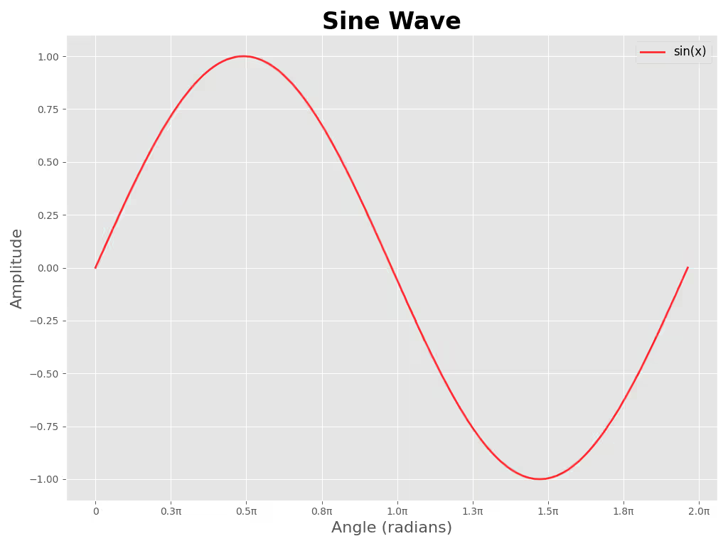
Referenz-Python-Code
sine_wave_plot.py
#!/usr/bin/env python3
"""Generate a sine wave plot in ggplot style and save to `sine_wave_plot_py.png`.

Usage:
    python3 plot_sine.py

Install dependencies:
    python3 -m pip install -r requirements.txt
"""

import numpy as np
import matplotlib.pyplot as plt
from matplotlib.ticker import FuncFormatter

plt.style.use("ggplot")

# Data
x = np.linspace(0, 2 * np.pi, 1000)
y = np.sin(x)

# Figure sized to approximate 1024x768 at 100 DPI
fig, ax = plt.subplots(figsize=(10.24, 7.68))
ax.plot(x, y, color="red", alpha=0.8, linewidth=2, label="sin(x)")

# Format x-ticks in multiples of π
def pi_label(value, _pos):
    val = value / np.pi
    if abs(val) < 1e-6:
        return "0"
    return f"{val:.1f}π"

ax.xaxis.set_major_locator(plt.MaxNLocator(10))
ax.xaxis.set_major_formatter(FuncFormatter(pi_label))

# Labels, title, legend
ax.set_xlabel("Angle (radians)", fontsize=16)
ax.set_ylabel("Amplitude", fontsize=16)
ax.set_title("Sine Wave", fontsize=24, fontweight="bold")
ax.legend(fontsize=12)

# Grid and layout
ax.grid(True)
plt.tight_layout()

# Save file
plt.savefig("sine_wave_plot_py.png", dpi=100)
# Uncomment to display interactively
# plt.show()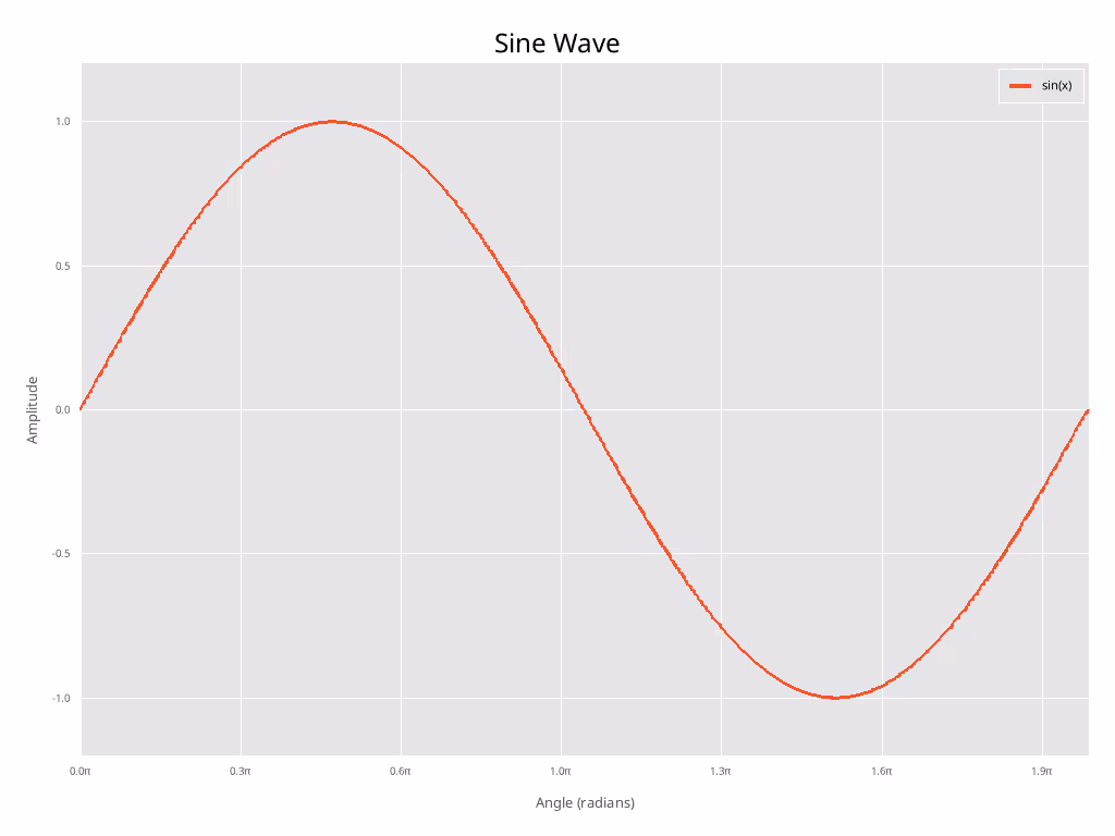
Diskussion der Unterschiede
Hinweis: Ich habe nicht versucht, die Schriftgröße etc. in irgendeiner Weise anzupassen.
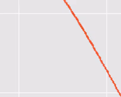
Wie Sie sehen können, sehen die beiden Plots mit etwas manuellem Aufwand recht ähnlich aus. Jedoch, da Antialiasing noch nicht implementiert ist im plotters-Crate (Stand 2026-01-30), sieht der Rust-Plot deutlich “gezackter” aus als der matplotlib-Plot.
Wenn man über Publikationsqualitäts-Plots spricht, ist dies ein erheblicher Nachteil und aus diesem Grund kann ich es nicht empfehlen. Hoffentlich wird Antialiasing in Zukunft implementiert.
Nahaufnahme des Python-Antialiasing
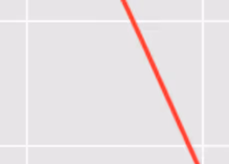
Nahaufnahme des Rust-“Antialiasing” (keines)
Check out similar posts by category:
Rust, Python, Data Visualization
If this post helped you, please consider buying me a coffee or donating via PayPal to support research & publishing of new posts on TechOverflow